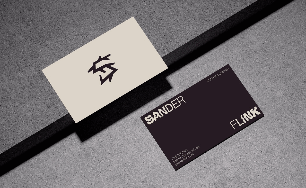
Originally, I designed three business cards with a style that turned increasingly more expressive and experimental. After revisiting this project, I decided to replace the most basic design with one that is more balanced and in line with the style that I chose for this portfolio.
Originally, I designed three business cards with a style that turned increasingly more expressive and experimental. After revisiting this project, I decided to replace the most basic design with one that is more balanced and in line with the style that I chose for this portfolio.
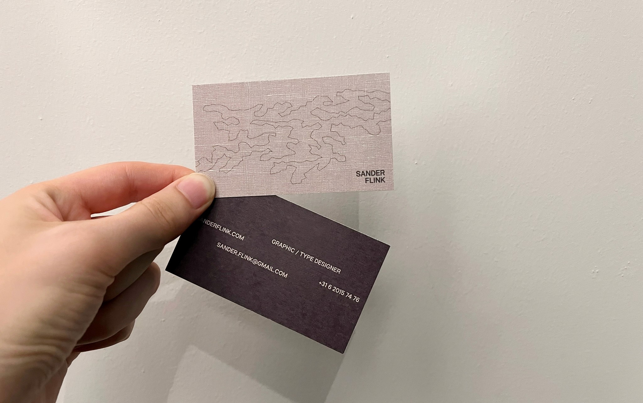
The final and definitive proposal is a continuation of the visual identity that is used for this book. A distorted SF sets the tone on the front whereas the back side maintains a minimalist aesthetic for the contact information without feeling boring.
This version was printed on a canvas-like paper, similar to the feel of the portfolio book cover.